

COMPANY OVERVIEW
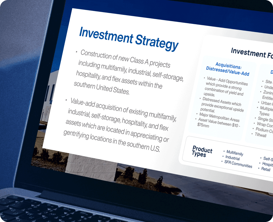
Realty Investments is a private real estate firm specializing in acquiring, developing, and managing commercial properties across the southern United States. Their portfolio spans multifamily housing, industrial spaces, hospitality, and more. With strong industry connections, they create valuable opportunities for investors and partners while revitalizing neighborhoods.
INDUSTRY
Real Estate
TIMELINE
2 Weeks
SERVICES IMPLEMENTED
Branding, Logo Design, Website Design & Wix Development, Mobile Responsiveness

The Challenge
Realty Investments required a website revamp to reflect a modern, high-end real estate brand. Their existing site lacked a compelling visual identity, smooth navigation, and engaging imagery. The client needed a sleek, user-friendly design that would enhance trust, professionalism, and lead generation. Additionally, they requested new or modified logos for the company
Project Goals
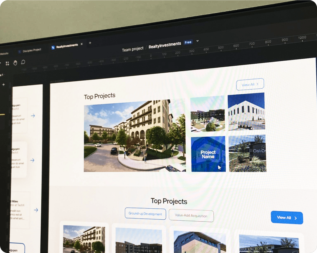
Redesign the website with a fresh, modern look while keeping the existing content. Create a user-friendly and visually appealing experience for potential investors and clients. Develop a new or modified logo for Realty Investments. Use Wix to ensure easy future updates by the client. Improve the homepage visuals by incorporating high-quality, relevant stock images. Prepare all design assets for future use and brand consistency
The Result
Enhanced Credibility: A sleek, modern design that positions Realty Investments as a premium real estate brand. Improved Lead Generation: Clear CTAs and an intuitive interface leading to higher engagement. Consistent Branding: A refined logo and design system aligned with Realty Investments for seamless brand transition
MY MESSAGE
We focused on creating a visual identity that reflects Realty Investments’ premium positioning in the real estate market. The layout was structured for clarity, allowing potential investors to navigate effortlessly. We used a sleek, modern aesthetic—combining bold headings, generous whitespace, and curated stock photography to build trust at first glance. The color palette and typography were carefully chosen to convey professionalism while maintaining approachability. Every design decision aimed to highlight credibility and make complex information feel digestible.

WEBSITE BEFORE

WEBSITE AFTER


BRAND IDENTITY

